Tomato Seeds Package Label Design

Case Study

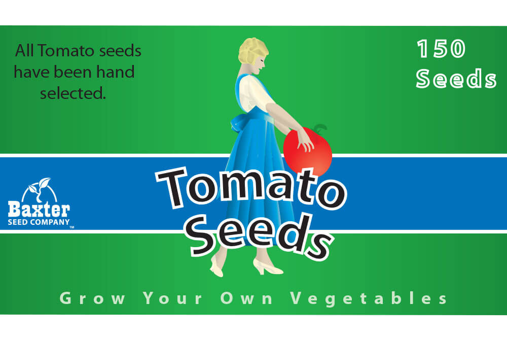
While attending technical school at Moore Norman Technology Center, I was given an assignment to produce a package label design for a fictitious product and business. The intent of this exercise was to demonstrate the process of branding and package creation. The result was a vector designed package label that can be utilized on product packaging.

The initial concept for the package label design was based on the creative direction and insights gained from a previous project. In this instance, I chose to produce something that had some similarities to the Morton Salt packaging. The design was produced using the vector design software, Adobe Illustrator.

The concept of the design was intended to reflect the bright red color of healthy tomatoes. The chosen typeface had a classic, retro look which fit well with the agricultural theme. The result was a simple yet thoughtfully designed package label for this fictitious entity.


Have Queries?

Unleashing the power of technology with our commitment to crafting code that transforms possibilities.

Request a Quote Today

Reach Us

Location :

Land O Lakes, FL 34639, USA

Phone :

+1-727-213-1736

    Attach any relevant material for your quote request

    Tomato Seeds Package Label Design

    While attending technical school at Moore Norman Technology Center, I was given an assignment to produce a package label design for a fictitious product and business. The intent of this exercise was to demonstrate the process of branding and package creation. The result was a vector designed package label that can be utilized on product packaging.

    The initial concept for the package label design was based on the creative direction and insights gained from a previous project. In this instance, I chose to produce something that had some similarities to the Morton Salt packaging. The design was produced using the vector design software, Adobe Illustrator.

    The concept of the design was intended to reflect the bright red color of healthy tomatoes. The chosen typeface had a classic, retro look which fit well with the agricultural theme. The result was a simple yet thoughtfully designed package label for this fictitious entity.

    Scroll to Top